Explicit vs Implicit Gamification: 5 Lessons That Change How You Design
 kevin1 March 2022
Most gamified products fail for the same reason: someone added points and badges to a workflow and called it engagement. The distinction between explicit vs implicit gamification explains why that approach collapses and what to do instead.
Explicit gamification is everything users can see: points, badges, levels, leaderboards, adventure maps. Implicit gamification is everything they feel without knowing why: pacing, feedback loops, progressive challenges, surprise. The explicit layer is decoration. The implicit layer is the engine. Both matter, but the competence ceiling of any gamification practitioner is determined by how much of their work lives in the implicit layer.
I have spent years helping companies decide where on this spectrum their products should land. Here are the five lessons that keep coming back.
Lesson 1: Bad Gamification Is Almost Always Explicit-Only
The reason bad gamification is synonymous with “points and badges” is that those are the explicit tools, and explicit tools are what untrained designers reach for first. They are the easiest to implement, the easiest to sell to a boss, and the easiest to measure. They are also the least durable.
A meta-analysis published in the 47th Hawaii International Conference on System Sciences reviewed peer-reviewed empirical studies on gamification and found that while gamification produced positive effects overall, the benefits were highly dependent on context and implementation quality. Slapping a leaderboard onto a product that lacks intrinsic motivation does not create engagement. It creates noise.
The pattern is consistent across industries. A wellness app that awards points for steps but gives users no reason to care about the steps beyond the points is not gamified. It is decorated. The points become the entire reason to engage, and when the points stop feeling novel, the engagement stops too.
Lesson 2: Implicit Design Is Harder to Build and Harder to Copy
LinkedIn is one of the most heavily gamified platforms on the internet. There is no health bar, no XP counter, no avatar. Yet your profile completion percentage is a Development and Accomplishment progress meter. Endorsements and “People You May Know” are Social Influence and Relatedness cues. “Who viewed your profile” is Unpredictability and Curiosity wrapped in business clothes. The full Octalysis Framework stack runs underneath, and the user feels professional momentum, not a game session.
That is the point. Implicit design works because the motivation feels like it comes from the user, not from a system reward. It is also why competitors cannot reverse-engineer it from a screenshot. You can copy a leaderboard. You cannot copy the pacing of a feedback loop that makes someone feel competent at exactly the right moment.
Apple Watch activity rings are another example. Three concentric circles that close as you move, stand, and exercise. No points. No badges visible on the main screen. Just a visual that tracks Development and Accomplishment and Empowerment of Creativity and Feedback in a way that feels like personal progress, not a scorecard. The rings are implicit gamification done well, and they are the reason many Apple Watch owners check their wrist more often than they ever checked a fitness app.
Lesson 3: Explicit Has a Hard Ceiling. Implicit Does Not.
You can only stack so many points, badges, and leaderboards before the system collapses under its own UI clutter. Every new badge needs to work harder than the last. Every leaderboard update needs to feel meaningful, or it becomes background noise. Explicit design is a whiteboard that runs out of room.
There is no equivalent ceiling on pacing, curiosity, empowerment, or meaning. Implicit design is a canvas with no edge.
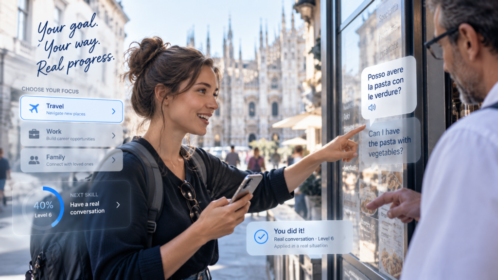
Look at Duolingo. The app uses heavy explicit mechanics: streaks, leagues, XP, gem rewards, and a mascot that nags you when you miss a day. These mechanics are effective at pulling users through onboarding and early scaffolding. But Duolingo’s retention problem is well documented. Once the novelty of the streak wears off, many users drift away despite the explicit rewards. The explicit ceiling has been hit. The next version of Duolingo’s engagement will need to come from the implicit layer: the satisfaction of actually understanding a language, not just the satisfaction of keeping a streak alive.
This is not a criticism of Duolingo. The explicit layer does real work in the Discovery and Onboarding phases. The lesson is that explicit mechanics are scaffolding, not structure. If you rely on them forever, you eventually hit the ceiling.
Lesson 4: The Smartest Move Is Converting Explicit Wins Into Implicit Ones Over Time
Start with visible mechanics to teach new users the shape of the experience. Then quietly retire those mechanics once the behavior is internalized. The user keeps doing the thing, but now because they want to, not because a progress bar demanded it.
Waze is the canonical case. When Waze launched, it used explicit gamification heavily: cartoon avatars, point systems, rank levels based on how many roads you mapped. The explicit layer got drivers to contribute data during the Discovery and Onboarding phases. But over time, the implicit layer took over. Drivers kept reporting road conditions not for points, but because the behavior became habitual and socially reinforced. The community itself became the motivation. Google acquired Waze for $1.3 billion in 2013, not because of the points system, but because the implicit design had built a self-sustaining data network.
I apply this transition pattern in most engagements. The explicit layer gets people through the door. The implicit layer keeps them in the building. When we worked with companies across the travel and finance sectors, the same pattern repeated: start with visible progress and celebration to build confidence, then replace the visible cues with pacing, narrative, and meaningful choice as the user gains seniority. The design evolves with the user.
The research supports this. A study published by the University of Hull on explicit and implicit gamification in higher education found that implicit approaches produced more sustained engagement over time, while explicit approaches produced stronger initial participation. The optimal design uses both, in sequence, not in competition.
Lesson 5: If You Cannot Sustain Explicit, Do Not Start
This is the most underrated lesson in the entire field. Explicit gamification has a brutal failure mode. If your team can hit only 70 or 80 percent of the quality bar, the result feels cheap, broken, and embarrassing. Half-finished cartoons read as amateur. Half-finished progression maps read as unfinished. Meanwhile, an implicit design at 80 to 90 percent quality ships, performs, and feels professional.
The honest question is not “should we go explicit?” It is “can we sustain explicit?” If the answer is no, implicit is the right call regardless of every other factor.
I have seen this play out in corporate training. A financial services company builds a compliance module with cartoon characters and a point system. The art is mediocre. The writing is flat. The leaderboard has three people on it. The result is worse than no gamification at all, because now the training feels patronizing instead of merely boring. The same content delivered with implicit design, clean feedback loops, clear progress indicators, and well-paced challenge escalation, would have performed better and cost less to build.
The decision framework I use with clients has four steps. First, honest capability assessment: can your team execute explicit gamification at a high quality level? Do you have artists, animators, and writers who can sustain the visual content pipeline a game layer requires? Second, market saturation check: how many existing solutions look identical to what you would ship implicitly? In saturated markets, explicit design can be the differentiator that earns a second look. Third, prototype both directions at finished quality and test them on actual end users. Fourth, let users decide, not management. The single biggest mistake in this field is letting the buyer project their own discomfort onto the audience. I have watched financial compliance teams at major institutions choose cartoon-style training over serious-looking alternatives when the test was actually run. People want relief from the boring parts of their work. They are not as serious as their bosses imagine.
What This Means for Your Design
Explicit vs implicit gamification is not a binary. It is a spectrum, and the right position on it depends on three things: your audience, your Experience Phase, and your execution capability.
In Discovery and Onboarding, explicit mechanics earn attention and build confidence. In Scaffolding and Endgame, implicit mechanics sustain engagement and create meaning. The best designs start explicit and fade toward implicit as the user grows. The worst designs stay explicit forever and wonder why engagement flatlines.
If you cannot name the Core Drive a mechanic targets, the player type it serves, and the Experience Phase it sits in, you are decorating, not designing. That test applies whether the mechanic is a badge or a feedback loop. The difference between good gamification and bad gamification is not explicit versus implicit. It is intentional versus accidental.
Working through where your product should land on this spectrum? Contact us.