In the 21st century we have the largest, oldest and longest living population the world has ever known. In 2014, the world population totaled around 7,3 billion people. In developed countries, 20% of the population was aged 65 or above, with a life expectancy of around 80 years old.
What is the cost of this expanding and ageing population? Well, developed countries now have health expenditures between 10% and 12% of their Gross Domestic Product. The greatest spender? The United States, with 17% of its GDP, or a staggering 3 trillion dollars. Wow…
Naturally not all health costs are age related. The point is that many diseases and conditions that lead to health expenditures can be avoided by something very simple: changing people’s lifestyle habits. If we all ate healthier and exercised more, these costs could be drastically reduced (there are a lot of articles corroborating this affirmative. If you want to know more, you can start by reading here, here or here.)
Big companies and startups have tried thousand of different initiatives to tackle this issue. By the end of 2015, there were 165,000 mHealth apps available for download in the Apple iTunes and Google Play stores. Unfortunately, a mere 36 of them (or 0,02% of the total) generate nearly half of all downloads. And none of these have conquered the market in any significant way. Not even Apple, Facebook or Google managed to be really successful with their mHealth apps.
The reason? A clear lack of engagement in these apps. Habit changing takes time, months or even years, and it is not an easy task to keep users engaged for a sustained period of time. Crafting an engaging app requires thorough understanding of human motivation, and cannot be achieved by simply adding a few game mechanics or nice visuals.
The Octalysis Group is known for designing long lasting user engagement using the Octalysis Framework. So let’s use Octalysis to analyze Fitbit, one of the biggest players in the healthcare and fitness market, and see how they fare in creating long-term engagement.
THE DISCOVERY PHASE: WHY DO I WANT TO TRY THIS APP?
Fitbit (NYSE: FIT, valued in $2,6B) is an American company that sells activity trackers that measure data such as the number of steps walked, heart rate, quality of sleep and stairs climbed. The company’s value proposition is that by measuring the user’s vital data and presenting it to them, it is possible to grow awareness for their own health and incentivize the adoption of healthy habits.
This data driven approach is a mainly Left Brain strategy (CD4: Ownership and Possession for measuring your own health and CD2: Development and Accomplishment for achieving your own goals). There is also a small Right Brain touch of CD7: Unpredictability and Curiosity, since you never know, for instance, how many steps you actually take in a day or what distance you have walked.
The Discovery Phase of any product begins when users first hear about the product or experience. If I search for “exercise tracker” on search engines, Fitbit is always one of the top 3 options. If I search for “exercise app”, it is also usually well ranked among the top 10.
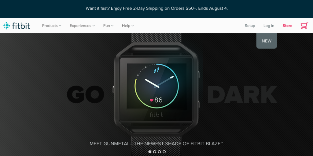
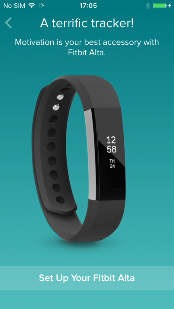
When I click on Fitbit’s webpage, the first image I see is a shining and beautiful new tracker that triggers both CD4 – Ownership and Possession (“I want this!”) and CD7 – Unpredictability and Curiosity (“What does it do? How much it costs?”). These are effective prompts for me to commit to Fitbit`s desired action here: buy their trackers. The app itself is not considered of main prominence on their website and it is only mentioned after some scrolling down.
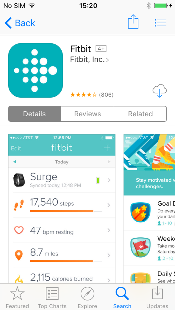
If I go directly to the Apple Store and search for “fitness” or “exercise tracker”, the results are not very encouraging for Fitbit. Their app appears on top 30 in the first search and top 50 in the second.
Their presentation in the App Store is consistent, tough. They have a decent number of qualified reviews (which triggers CD5 – Social Influence and Relatedness) and they show some cool screens containing progress bars, badges, graphs and others (that resonates well with CD2 – Development and Accomplishment).
In a nutshell, Fitbit`s Discovery Phase is strong in CD2 (follow my health developments with the progress bars, points and badges) and CD4 – Ownership and Possession (build my complete fitness profile).
THE ONBOARDING PHASE: PUT YOUR RUNNING SHOES ON AND COME ON BOARD
The second phase of the user’s experience to Octalysis is called Onboarding and it has the goal of teaching the rules of the game to new players. It starts when users download the app and ends when they have learned the fundamental skills needed to play the game and achieve early win-states.
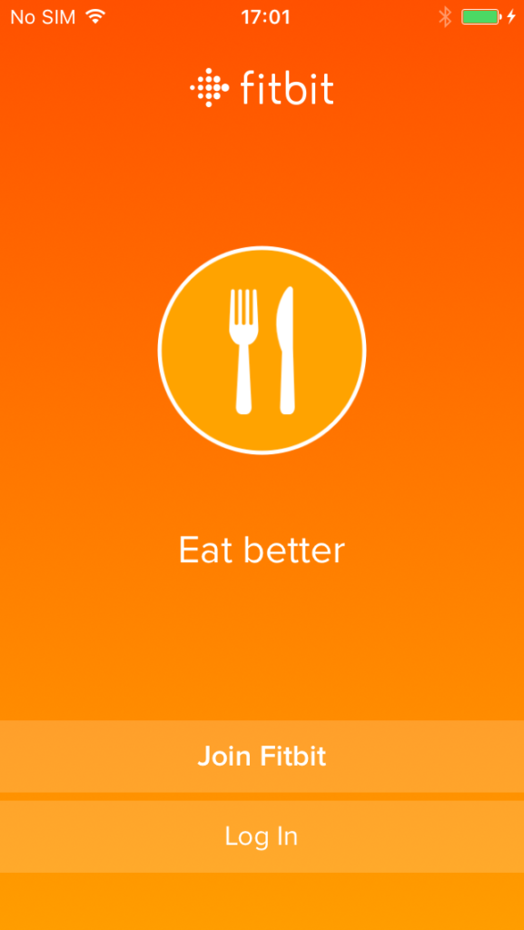
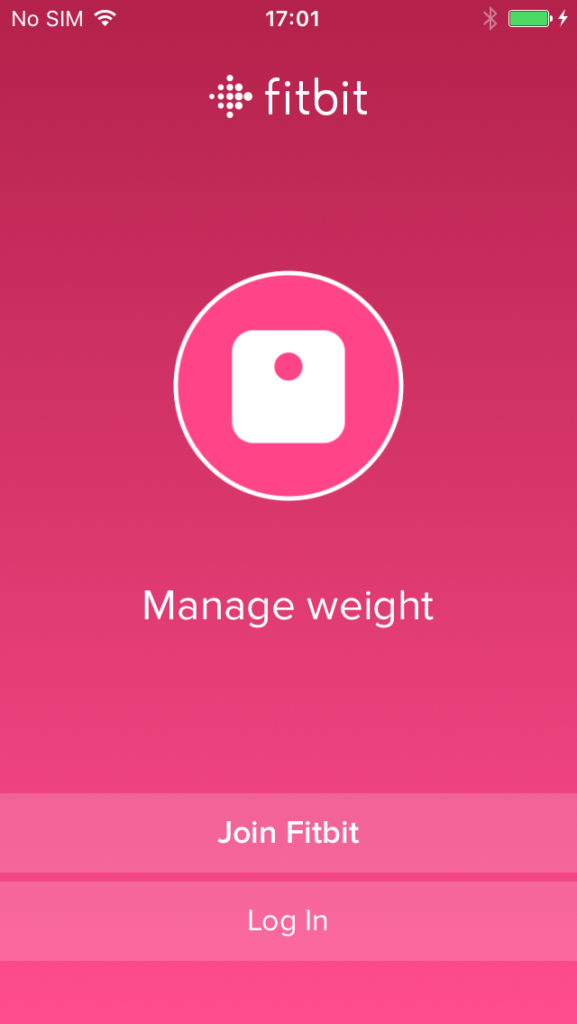
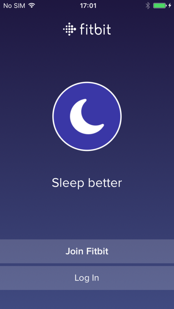
After installing Fitbit, I am presented with a sequence of colorful screens that keeps transitioning in my phone with different value propositions for me: get active, eat better, manage weight and sleep better.
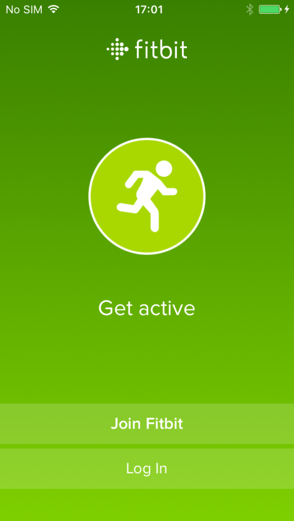
I guess we want all of that, right? The call to action is very clear here too: Join Fitbit or Log In. Since I do not have an account yet, let me see what happens when I click the “join” button.
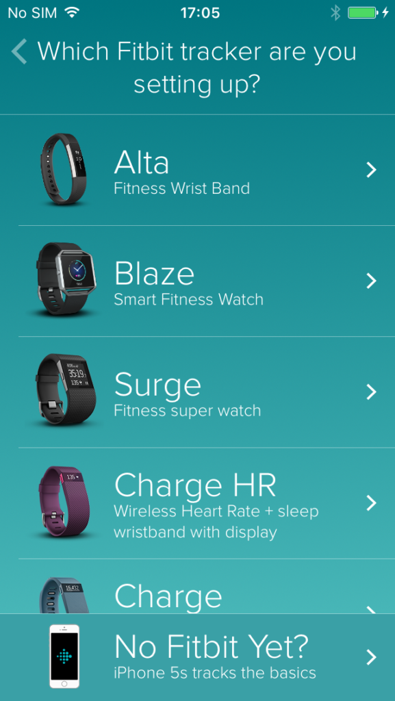
Oops! Apparently I must own one of the shining Fitbit trackers to join the party… and I do not. Fitbit could use this screen to try to convince me of the importance of having a tracker for a complete experience, but it simply shows me a list of all their trackers. They all look nice, but I am still not convinced why I should buy one to count my steps if my phone accelerometer can do that for me and even estimate how many calories I have burned.
So I guess this is game over for me with Fibit, right? Oh no, wait! Take a look at the above screen again. Hidden in the bottom, there is a timid “No Fitbit Yet? iPhone 5S tracks the basics” message. Well, I guess I will have to satisfy with the basics then!
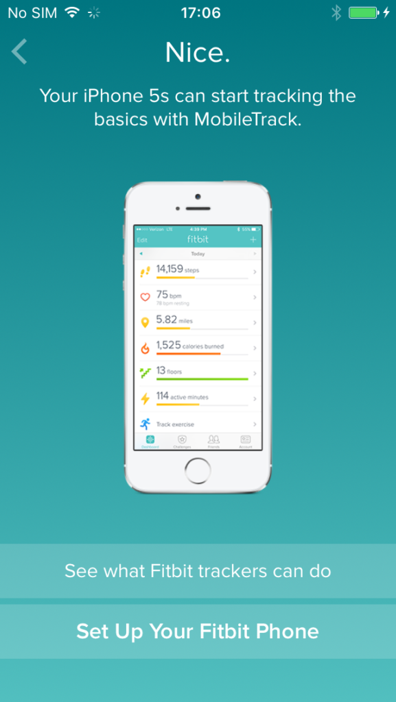
After choosing to use my phone, Fitbit decides to tell me about what their trackers can actually do. This is not a smart decision. During the Onboarding Phase, the product/system must do everything possible to make the users feel smart and accomplished (CD2), and not questioning their choices.
I know Fitbit’s business is very dependent on selling their tracking devices, but I am sure they have better places to show me how my experience can be enhanced with their trackers.
Proceeding with the Onboarding experience, Fitbit asks me to input some vital data:
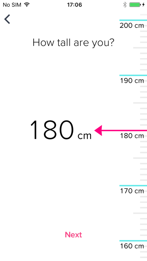
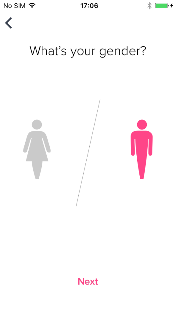
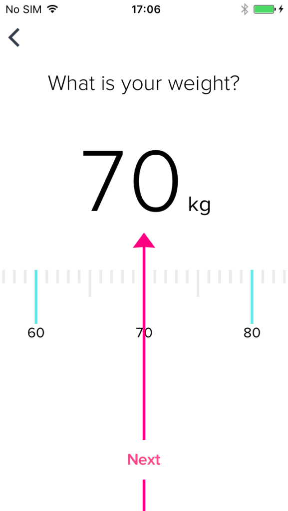
The interface for inputting data is very clear and intuitive (even fun!) and I do not feel bothered for sharing some personal data, since I hope this will make my experience more personalized. How could I trust a health app that does not even know my height and weight, right?
Since I am still onboarding in the app, it would be smart if Fitbit asks me only for the most relevant data for personalization purpose (spoiler: they do) and also shows me some sort of progress to have an idea of how many more inputs lies ahead of me (spoiler: they don’t).
After some Terms of Service and Privacy Policy screens – I assume mandatory for this kind of app – I finally arrived at the promised land: Fitbit’s main screen!
If you are not familiar with Fitbit and are following this experience with me, I propose a small exercise. Contemplate the screen below for 8 seconds – the usual attention span for mobile phone users – and answer me: where would you click first? Important: If you are under 18, you can contemplate the screen for 4 seconds or less. I don’t want to keep you waiting for endless 8 seconds. And if you are a goldfish, you can take your whole 9 seconds, don’t worry. I will wait.
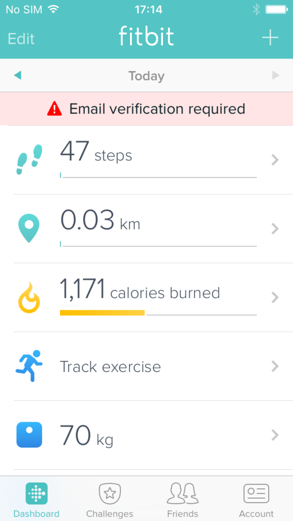
So, what is your answer? Where would you have clicked?
- In the “red alert” email verification label?
- In the “number of steps” counter?
- In “calories burned”?
- In “Track exercise”?
- Somewhere in the inferior Dashboard/Challenges/Friends/Account menu?
- Anywhere else?
You could argue that it depends on the user goals with the app, but let’s assume that it is just a user trying to know the app better, like you and me. What we are trying to figure out here is: according to Fitbit, what is the desired action in this screen, the first one the users see and probably the most important in their entire experience?
The correct answer is clearly letter A. Or B. It could be C also. And maybe D… I think you got the point. There is no clear desired action in this important screen and since all of the elements are new to the user, it is easy to feel lost here. “Feel lost?”, I can hear you and Fitbit’s UI designers scream, “this is the simplest app screen I have ever seen! It is simply a dashboard!” Exactly. It is simply that and nothing more. What kind of action a dashboard prompts you to do? Look at it and if nothing changes (hopefully, otherwise you would probably not understand what is happening), then you are gone. Imagine that we – the users – are like Homer Simpson in front of a power plant control panel. If there is not blinking, we will assume everything is fine and we will keep eating our donut. If everything is blinking, we will panic and probably will not act either.

This is the feeling Fitbit’s above screen gives me: it is all fine and static, so I can go eat my donut safely.
Since I am not planning on doing an exercise right now, I am prone to leave the app now and return to it later, after some steps. Or maybe return in the end of the day. Or after some long random walk to see how many steps I did. If I remember that I have downloaded the app, of course. The point is that a successful app should never leave the users with this kind of decisions or might risk losing them.
For Fitbit’s fans, a comment: Fitbit app has hundreds of things that are done right in their main screen. It is visually simple; the colors are great; it lets me login first and verify my email later; it shows me some progress and many more good designs. Take a look at the following screen, for instance.
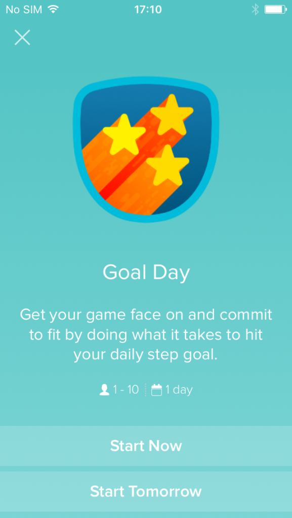
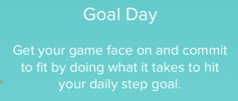
Pretty cool, right? This is the “Challenges” section of the inferior menu bar and it presents me with a series of challenges I can commit myself to. If I click on the first one (apparently the only one I can do alone), it challenges me to hit my “daily step goal”. Not sure what this is, but let’s do it! By the way, very nice and thoughtful option of “starting tomorrow”. Probably by choosing this option the user will be reminded of the challenge first thing in the morning. This is a great use of the Choice Perception (Game Technique #89). If a user clicks in a challenge out of curiosity, for example, he is presented with two main options: start now and start tomorrow. If he does not want to start now, the Start Tomorrow option seems tempting; after all, it will not sound as if he is not willing to take the challenge. But if you stop and think, both options are the same: start! And certainly this is the desired action in this screen, so way to go Fitbit!
If I choose any other challenge that demands at least one more participant or click in the “Friends” option in the inferior menu bar, I end up in the following screen.
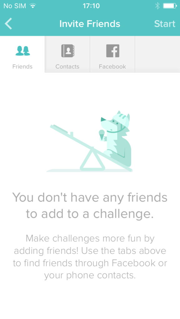
Is it just me or this is the cutest fox ever? She just wants to play and is even offering me ice cream. And I do not even need to worry about her safety, because she has her helmet on!
Every app with any kind of social interaction (in other words, every app except for you lantern) deals with the problem of making the user invite their friends to use the app or showing them their friends that are already using the app. The latter is easier and is usually achieved by social login. But how to prompt users to invite their friends for something they do not even know yet?
The simple answer is: let them know the app first. The best way to ask users to invite their friends is after the First Major Win-State, that moment when the users reached a ‘wow’ moment and would almost automatically think: “Cool! I wanna share this with my friends!” When the app allows user invitation at any moment, like Fitbit does, the most important advice is to never leave the users with the bitter taste of a bad experience like “You have no friends” and nothing else. There are at least two much better options to dealing with this problem.
The first you can find out in most of The Octalysis Group projects (do the words Scarcity and Curiosity sound familiar to you?), but the second is exactly what Fitbit has done: use some sense of humor.
Using humor is a great UX practice and makes users wondering, “When the next joke is coming? Are there more funny screens?”, which resonates with CD7 and help in the engagement process.
The second phase of the user experience – Onboarding – ends when the user has done all the main desired actions at least once and is familiar with the game rules. Fitbit app has a lot of desired actions, but we will consider this phase finished with the following screen.
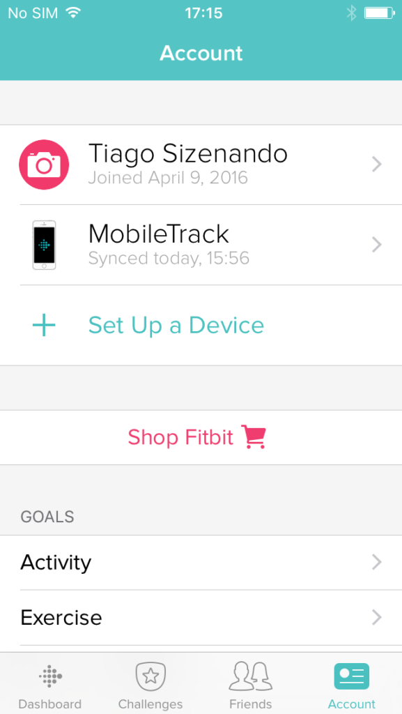
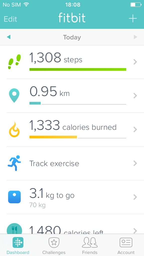
This is the “Account” tab of the inferior menu, the last main option. My eyes are immediately caught by the first half of the screen, where I can review my profile, sync and set up new trackers and also buy a Fitbit tracker if I am convinced they are essential to my experience (and so far, I am not). My eyes were not attracted to what is below the “Shop Fitbit” button, mainly because they are colorless and not attractive. Keep that in mind, because this will be decisive for my future experience with the app.
Having done the main desired actions at least once, now it is time to start walking and running with my phone to see how Fitbit will help me to be healthier.
THE SCAFFOLDING PHASE: MY POINTS AND STATS JOURNEY
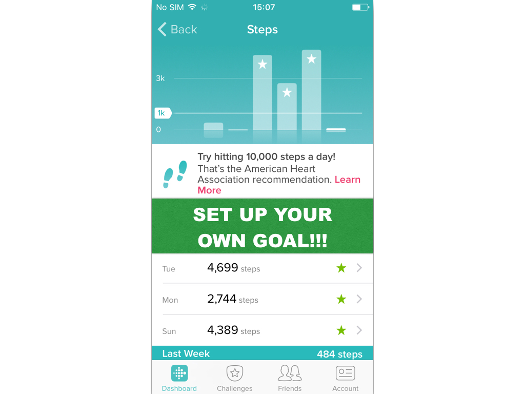
My plan was to keep the cellphone in my pocket for a whole week and check Fitbit at the end of each day to see how I was doing. Unfortunately, this plan only lasted three days (check the screens below).
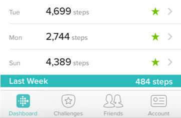
They look like three days of complete failures, right? The problem is that I was walking! On Tuesday I have even walked more than usual, parking my car more distant than where I usually do just to take some more steps. Nevertheless, it was a failure again.
I have decided to explore the app one more time to try to make my experience more rewarding, because I am still on the first steps and feeling accomplished remains a priority. If I get a whole week of failures with no explanations, the sense of development and accomplishment (CD2) is gone and probably I will be gone too.
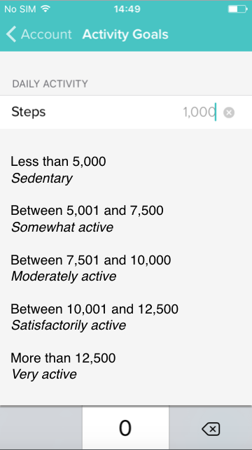
My first try was to go back to the “Goal Day” challenge screen to see if I could change the challenge parameters in some way or at least find out what the step goal actually is, but that was in vain. Then I have tried the “number of steps” in the first screen, but all I could see was my step count history. I was about to give up when I clicked in the infamous “Account” tab once more, simply because it was the only one I have not clicked yet. And there it was.
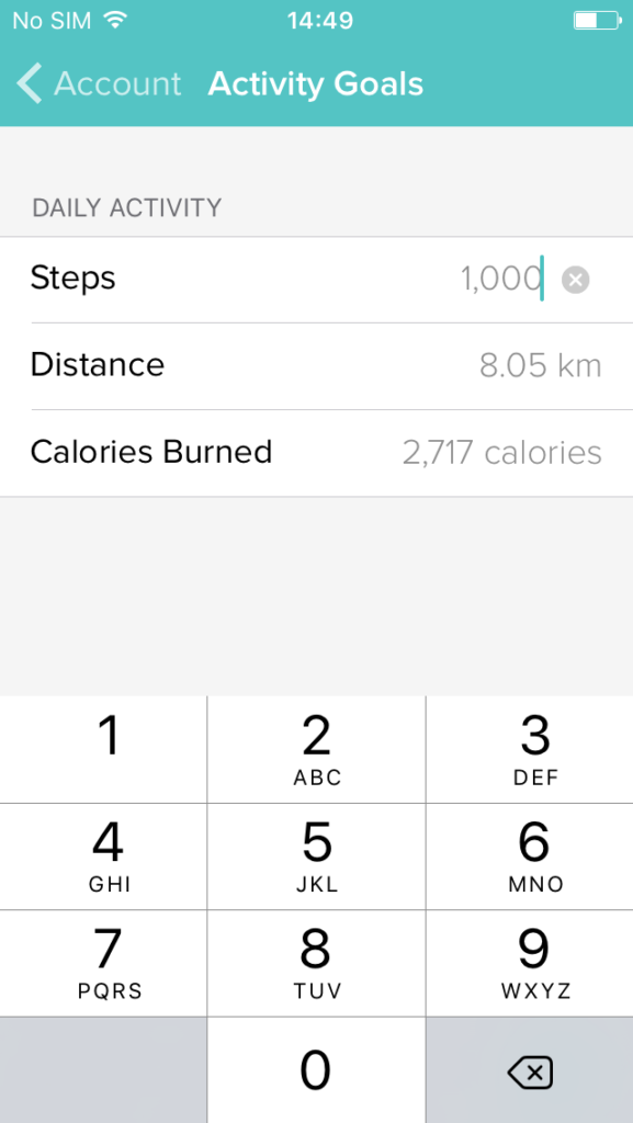
You are probably thinking that I am stupid for not seeing this before, right? I mean, in case you have already seen where I am supposed to click to change my daily step goal in the above screen (it is still not obvious!). In my defense, when I am testing a new product, I like to turn the “stupid mode on” to make sure the experience is crystal clear to the user. Sorry to say this, Fitbit, but yours is not. The customization of such an important feature is hidden in the bottom half of the last tab screen, vaguely named “Account”.
I was curious to see how many opportunities Fitbit had during my Onboarding to link me directly to the above screen. Count with me, please: I can see one, two, three…

… and an obvious fourth one! There is absolutely no reason for not having a button like the one below in my main ‘Steps Dashboard’ screen:
I have decided to change my daily step goal to an easy 1,000 steps count just to (finally) feel accomplished. I did this, put my sneakers on and hit the road as if I were Forrest Gump, determined to stop only when I had reached my goal.
Ten minutes later and victory was mine.
Something as simple as that helped me feel more accomplished and willing to try new goals. If the app value proposition circles around accomplishment and measurements, why not making your users feel accomplished as soon as possible?
Addendum: I have decided to explore some more about this step count goal and I have find out in Fitbit’s blog that the default goal is 10,000 steps a day, something recommended by the CDC, but definitely not an easy task to sedentary people. Nevertheless, it would not hurt Fitbit’s app to explain this to the users in simple terms without redirecting to their blog. It could even shows the users some sort of guiding table like the one I have done after a rigorous 5-minutes research on Google.
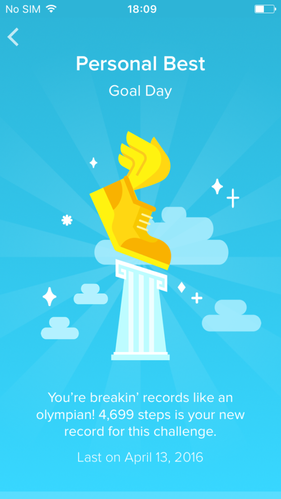
The ironic part of a fitness app that does not like to give their users easy wins, is that Fitbit actually has some cool badges and rewarding screens. Take a look at this screen solely dedicated to show me my personal best number of steps in a single day.
Fitbit has several other cool functionalities, like calories count, eating goals, sleep quality control, GPS tracking during exercises, friendly competitions and more. I could go on and on writing about these, but if you have reached this far, you probably got the idea of the kind of app analysis we do in The Octalysis Group and would be happy with some wrapping up, I suppose. So hold on for three more minutes, because we have reached the Endgame.
THE END GAME PHASE: GAME OVER OR GAME ON?
The Endgame Phase begins when the users have completed the activity loop of desired actions → win-states → rewards so many times that they are true veterans of the experience. Instead of letting these players leave – after all, they have already used the app a lot -, the system should recognize their value and adapt itself to be even more engaging to them.
Since Fitbit app is daily collecting health information from their users – even if they do not have any trackers -, it is understandable that they reach the Endgame Phase with a CD4 – Ownership and Possession and CD8 – Loss and Avoidance combo. They have already stored so much information in the app that it gets less and less attractive each passing day to change it for some other. Fitbit has also some improvements to do towards Endgame: their experience becomes predictable as time goes by (no CD7) and the the users do not experience any form of Epic Meaning and Calling (CD1).
In The Octalysis Group, we usually conclude the analysis of each of the four phases of a product experience with a summary of the main takeaways and a list of quick fixes. Since I am not planning on sharing more screens with you, I will share some of the Endgame suggestions we have done for Fitbit so you can have a better understanding of the kind of work we deliver:
- Use a combo of CD4 and CD7 to give users a surprise discount in a new and more advanced Fitbit tracker. For instance, if the user completed all the challenges using a simple step counter tracker, he could get a huge discount in a tracker that also monitors sleeping, so he will be motivated to try the Fitbit app again with a more powerful “weapon” that will work as a booster.
- Use CD2 to unlock more powerful and “almost impossible” challenges to players that have completed all the available challenges.
- Use a combo of CD3 and CD7 to allow veterans players to create their own challenges that could be available to all other players. This would motivate CD3 for the creation process and also CD7 to keep coming back to the app to see the new challenges.
FINAL REMARKS
The healthcare wearable’s global shipments are expected to increase at a compound annual growth rate of 24.8% over the five years, reaching 162.9 million units in 2020. Not surprisingly, great names like Apple, Google and Microsoft are already launching its first products in this attractive market.
But what is the final verdict for Fitbit experience? Did they solve the ‘gold pot’ problem of the long-term engagement? There are good and bad news for the competition. Fitbit has the upper hand in this market and sells a lot of tracking devices options; so it is not going to be easy to steal its market share. Every day that Fitbit collects data from their users, it enhances the feeling of Ownership and Possession (CD4) and leaves the user afraid of losing precious health history and a system they already know so well (CD8). As long as the years keep ending in December 31th and people keep making new-year resolutions to be fitter and thinner, Fitbit will thrive.
The good news for competition is that Fitbit has not solved the long-term engagement problem. It certainly has a great app that is useful to be combined with its physical trackers, but so far the experience is mainly focused on just one player type (Level 3 Octalysis) and has not been able to adequately balance the eight Core Drives during the four experience phases of the player journey.
The history of the tracking devices for healthcare is in its first pages and Fitbit is helping writing them. As long as user motivation remains a relevant problem for behavior changing, The Octalysis Group will keep tracking this market.
Final note: This blog post is a small sample of an Audit, one of the services The Octalysis Group offer to his clients.
If you want to know more about what Octalysis can do for your organization to drive engagement, contact us at:
Joris[at]octalysisgroup[dot]com
Tiago[at]octalysisgroup[dot]com